


Most tutoring sites rank for something, get a trickle of visitors, and then nothing. The traffic shows up, pokes around, and leaves. No trial booked, no call requested, no email captured. Then the owner blames traffic quality ("parents just aren't serious") when the real problem is that the pages doing the heavy lifting — trial, pricing, and outcomes — are built to describe the business instead of moving someone toward a decision.
This is a working tutoring website SEO kit for those three page types. Not a "10 SEO tips" listicle. Actual copy skeletons you can paste and edit, the exact analytics events to wire up so you stop guessing, and a small experiment matrix so you can test changes without turning your site into a science fair.
The scope here is narrow on purpose: turning organic visitors into trial sign-ups. Not blog strategy, not backlinks, not technical audits. Just the conversion layer where most centers quietly leak.
Why organic visitors leave your trial page without acting
There's a pattern that shows up again and again when you look at the actual pages, not the traffic reports.
A parent Googles "algebra tutor near [town]" or "reading help for 2nd grader." They land on a page that opens with a paragraph about the center's mission and philosophy. Somewhere below the fold there's a "Contact Us" form with eight fields. No clear next step, no sense of what happens after they click, and no answer to the one question they actually have: will this help my kid, and what does it cost me to find out?
The visitor isn't confused about tutoring. They're confused about what to do next on your specific page. That's a copy and structure problem, and it's fixable without touching your rankings at all.
A few specific reasons high-intent pages underperform:
-
The page talks about the center ("we've been serving families since 2011") instead of the outcome the parent wants.
-
The "trial" is vague. Is it free? Paid? How long? Who shows up? Parents won't commit to ambiguity involving their kid's time.
-
Pricing is hidden entirely, which forces a phone call the parent doesn't want to make yet.
-
There's one giant call-to-action buried at the bottom and nothing above the fold.
-
No proof. No sample results, no parent quotes tied to a real situation, nothing that reduces the "is this legit" risk.
The visitor already had intent — they searched for exactly what you offer. The page just failed to convert that intent into an action.
The three pages that matter, and what each one is actually for
Before the templates, it helps to be clear on the job of each page. They are not interchangeable.
Never miss another tutoring session.
Tutoryly helps you schedule, confirm, and manage every tutoring session efficiently.
- Unified session scheduling
- Automated student notifications
- Tutor calendar & availability management
No credit card required
| Page | The visitor's mindset | The one job of the page | Primary action |
|---|---|---|---|
| Trial / booking | "I'm close. Show me how to start with low risk." | Remove friction and ambiguity from starting | Book or request trial |
| Pricing | "Can I afford this and is it worth it?" | Make cost feel fair and predictable | Choose a package → trial |
| Outcomes / results | "Will this actually work for a kid like mine?" | Reduce risk with proof and specifics | Move to trial/pricing |
The mistake most centers make is writing all three in the same tone with the same information. The outcomes page needs proof and specificity. The pricing page needs clarity and framing. The trial page needs friction removal. Same voice, different jobs.
Copy template: the trial / booking page
This is the page organic visitors hit most often when they're ready. Structure it top to bottom like this.
Above the fold — headline + subhead + primary CTA
> Headline: Book a [Subject] Trial Session for Your [Grade] Student > Subhead: A [30/45]-minute session with a real tutor. We'll assess where your child is, show you exactly what we'd work on, and you decide from there. [Free / $X]. > CTA button: Book the trial session > Micro-copy under button: Takes about 90 seconds. No card required to book.
That subhead does three things: sets the format, sets expectations for what happens, and states the price honestly. "You decide from there" removes the pressure that makes parents hesitate.
Section 2 — What actually happens (the 3-step preview)
Parents commit faster when they can see the whole thing before starting. A simple numbered walkthrough:
-
You book a time — pick a slot that works, tell us the subject and grade.
-
Your child meets their tutor — a short, low-pressure session where we assess and teach, not just test.
-
You get a plain-English recap — what we saw, what we'd focus on, and what it would cost. No obligation.
This preview is doing heavy conversion work. It's the difference between "sign up for the unknown" and "here's exactly what you're saying yes to."
Section 3 — Short proof block
Two or three specific parent lines. Not "great tutors!" but something concrete: "My son went from dreading Thursday math to asking if he could do an extra session. The tutor actually explained the way he thinks." Specificity beats star ratings.
Section 4 — FAQ that removes the last objections
Keep it to 4–6 questions that map to real hesitation: How long is the trial? What if my child is shy? Can I sit in? What if it's not a fit? What happens after?
Section 5 — Repeat the CTA. Same button, same micro-copy. People scroll to the bottom when they've decided; give them the button there.
If you want the deeper mechanics of what happens after the trial is booked — the timing and scripts that turn that first session into a paying family — that belongs to a separate playbook on converting trial students into paid enrollments. This page's only job is getting the booking.
Copy template: the pricing page
The pricing page fails most often by hiding the number. Parents who can't find a price assume the worst and bounce. A cleaner approach:
Lead with the framing, not the number. One sentence at the top that sets the value context: "Most families start with 1–2 sessions a week. Here's what that looks like."
Show 2–3 packages, not a wall of options. Three is the sweet spot — a light option, a recommended middle (label it clearly), and an intensive. Anchor on the middle.
The package layout:
| Weekly Support | Core Plan — Most Popular | Intensive |
|---|---|---|
| 1 session / week | 2 sessions / week | 3+ sessions / week |
| $XX per session | $XX per session | $XX per session |
| Best for maintenance | Best for real progress | Best for exam crunch |
| [Start with a trial] | [Start with a trial] | [Start with a trial] |
Note the CTA on a pricing page is not "buy now." It's "start with a trial." You're routing them to the low-risk action, not asking for a full commitment from a page they found through search.
Add a "what's included" line under each. Progress recaps, session notes, whatever you actually provide. Parents compare on inclusions more than they compare on raw price.
One honest note about billing. A single sentence like "No long contracts — pause or adjust anytime with a week's notice" removes a surprising amount of hesitation. Predictability sells.
Copy template: the outcomes / results page
This is the page that ranks for research-phase searches ("does tutoring actually help with...") and the one most centers don't have at all. Its job is proof.
Open with a specific outcome, not a claim. Instead of "We help students succeed," use something like: "How we helped a 7th grader go from a low C to a solid B in one semester of weekly sessions." Then tell that story in three short paragraphs — where the student started, what the plan was, what changed.
Follow with a small results table. Even qualitative is fine:
| Student situation | What we focused on | What changed |
|---|---|---|
| Struggling with fractions, avoiding homework | Rebuilding number-sense basics before grade-level work | Started completing homework without prompting |
| Bright but anxious test-taker | Timed practice + confidence routines | Went into the state test calm, scored proficient |
Close with a soft bridge to the trial. Something like: "Every one of these started with a single trial session. Here's how to book one."
The outcomes page works best when it's honest and specific. Round, perfect success stories read as fake. A story with a realistic arc — slow start, then progress — reads as true and converts better.
The analytics events you actually need
You can't improve what you can't see, and most tutoring sites track pageviews and nothing else. Pageviews tell you almost nothing about conversion. You want events — the small actions that reveal where people drop.
Here's a simple event wiring workflow.
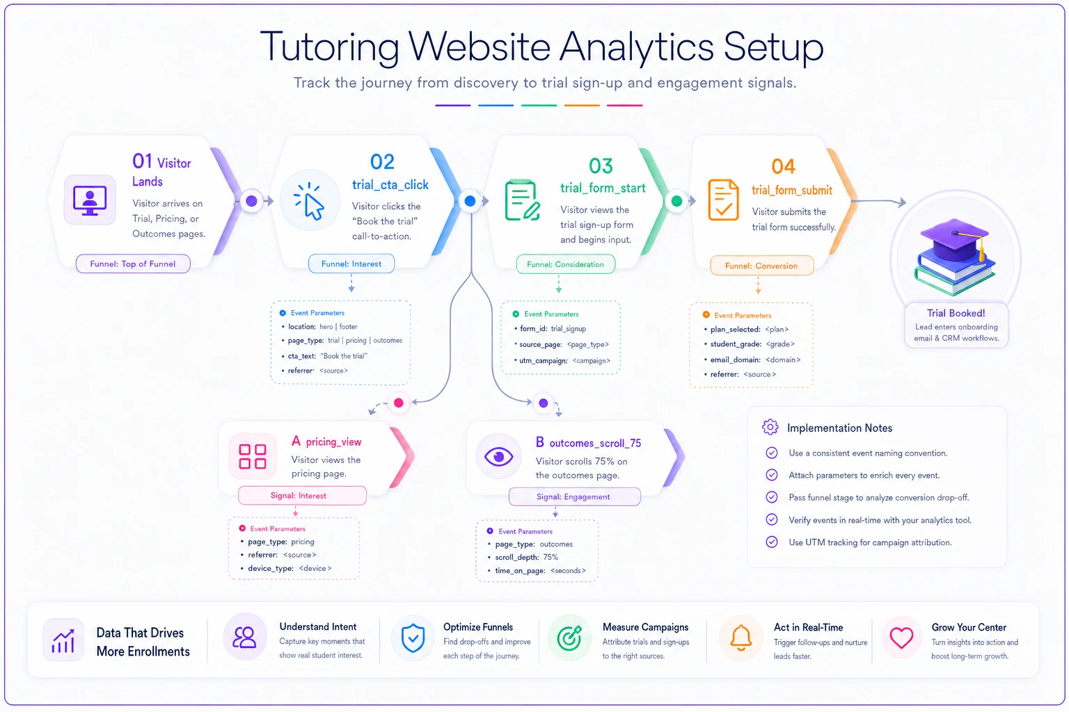
Here's a lean event set to wire up (works in GA4, or any tag manager). Don't overbuild this; more events than you'll actually read just create noise.
-
trialctaclick— fires when any "Book the trial" button is clicked. Add a parameter for location (hero,footer) so you know which placement works. -
trialformstart— fires when the visitor focuses the first form field. The gap between CTA clicks and form starts tells you if your form is scaring people off. -
trialformsubmit— the actual conversion. This is your north-star event. -
pricing_view— fires on pricing page load. Compare against trial submits to see if pricing helps or hurts. -
pricingpackageclick— which package gets clicked most. This alone reveals whether your "most popular" label is doing its job. -
outcomesscroll75— fires when someone scrolls 75% down the outcomes page. Deep scroll on a proof page is a strong intent signal. -
faq_expand— fires when a FAQ item opens. The most-opened question is your biggest unaddressed objection — move that answer higher on the page.
The single most useful number this gives you is the CTA-click-to-form-submit ratio. If lots of people click "Book the trial" but few submit, your form is the leak, not your copy. Most centers assume the copy is the problem when it's actually a seven-field form asking for a home address before the trial even happens.
A small experiment matrix (so you test without chaos)
The temptation is to change everything at once and then have no idea what worked. Instead, run one focused test at a time on your highest-traffic page. Here's a starter matrix — pick the row that matches your biggest suspected leak.
| If your leak is... | Test this | Against this | Measure |
|---|---|---|---|
| Few CTA clicks at all | "Book the trial session" | "Get started" / "Contact us" | trialctaclick rate |
| Clicks but few form starts | 3-field form | current long form | trialformstart → submit |
| High bounce on pricing | Prices shown | "Contact for pricing" | pricingview → trialform_submit |
| Low trial page conversion | 3-step "what happens" preview | no preview | overall submit rate |
| Outcomes page not converting | Specific story headline | generic "Our Results" headline | outcomesscroll75 + downstream submits |
Rules that keep this sane:
-
One variable per test. If you change the headline and the button and the form, you learn nothing.
-
Let it run. For most tutoring sites, organic traffic is modest — you often need 2–4 weeks per test to trust the result. Calling a winner after three days is how you fool yourself.
-
Pick tests by traffic. Test your busiest page first. A 15% lift on your top page beats a 40% lift on a page nobody visits.
-
Write down the result. A one-line log ("swapped to 3-field form, submits up noticeably over 3 weeks, kept it") saves you from re-running the same test next year.
Here's a starter matrix — pick the row that matches your biggest suspected leak.
A realistic before-and-after
Consider a two-location center that ranked decently for a handful of local subject terms but converted almost nothing from it. Their trial page opened with a mission statement and had a nine-field "inquiry" form. Analytics? Pageviews only.
They made three changes over about six weeks: rewrote the trial page to lead with the outcome and a 3-step preview, cut the form to name, subject/grade, and contact, and wired up the event set above so they could actually see the funnel.
The event data immediately showed the real problem — plenty of trialctaclick events, very few trialformstart. The long form was the leak, not the copy. After cutting the form down, trial requests went from a handful a month to something in the low double digits, without any change in traffic. Nothing about their rankings moved. They just stopped losing the visitors they already had.
That's the whole point of this kit.
When this kit makes sense — and when it doesn't
This makes sense when you're already getting some organic traffic to your key pages but conversions are flat, and when you can commit to actually reading the event data instead of just installing it and forgetting.
This is a bad idea when you have almost no organic traffic yet. If ten people a month hit your trial page, no amount of copy testing will produce reliable results — you don't have the volume to learn anything. Fix visibility first, then come back to conversion.
Who should not obsess over this: a solo tutor with a full roster and a waitlist. If you're turning families away, page optimization is a distraction. This kit is for centers with capacity to fill and traffic that's currently going to waste.
Where this connects to the rest of your operations
A converting page is only worth it if what happens after the click is smooth. A parent who books a trial in 90 seconds and then gets a confusing intake experience will still walk. It's worth making sure your booking flows straight into a clean onboarding process — the intake forms, the initial assessment, the first-session agenda that makes families feel taken care of. If that part is shaky, the structure in a solid student onboarding checklist closes the gap between "booked a trial" and "showed up feeling confident."
The pages get them in the door. The operations decide whether they stay.
Start with one page and one number
Don't rebuild your whole site this weekend. Pick the page that gets the most organic traffic — usually the trial page — wire up trialctaclick, trialformstart, and trialformsubmit, and watch it for two weeks. That three-event funnel alone will tell you whether your problem is the copy, the form, or something else entirely.
Then run one experiment from the matrix. Log the result. Move to the next leak. Conversion work isn't a big dramatic overhaul — it's a series of small, boring, honest tests on pages that already have visitors who wanted what you offer in the first place.
Don't rebuild your whole site this weekend. Pick the page that gets the most organic traffic — usually the trial page — wire up trialctaclick, trialformstart, and trialformsubmit, and watch it for two weeks. That three-event funnel alone will tell you whether your problem is the copy, the form, or something else entirely.
Then run one experiment from the matrix. Log the result. Move to the next leak. Conversion work isn't a big dramatic overhaul — it's a series of small, boring, honest tests on pages that already have visitors who wanted what you offer in the first place.
Ready to streamline your tutoring operations?
Join 500+ tutors and centers using Tutoryly to save time, improve scheduling accuracy, and enhance student experiences.